Perfect YouTube Thumbnail Size and Best Practices
Perfect YouTube Thumbnail Size and Best Practices
If you intend to accumulate more eyeballs for your YouTube videos, you can employ thumbnail images to get them quickly.
Thumbnail images have the same significance as the video’s title if you are aiming to get more views. These images attract your audience and assist in making you stand out from the crowd. These image thumbnails are also portrayed in Google’s search engine result pages and hence they are important to optimizing your impressions.
This post is geared towards discussing everything about YouTube thumbnails including the perfect size, how to make them and the best practices that are being carried out by the most popular YouTubers.
Perfect YouTube Thumbnail Size
The most important aspect to consider while discussing all the relevant topics is to figure out the best YouTube thumbnail size. Google recommends YouTubers to use images with a resolution of 1280 x 720 pixels and a minimum width of 640 pixels. An aspect ratio of 16:9 is perfect as it is commonly used in most of the YouTube videos and previews.
This does tend to surprise a few people but it is logical. When displayed in search engine result pages, the thumbnail will be small but when it will be displayed as a suggestion for the next watch, it will be transformed into a full sized video. That is exactly a why a larger image size that can be scaled down will come in handy in contrast to a smaller one that will have to be scaled up.
Here are a couple of important technical details:
- Supported image formats include .JPG, .GIF, .BMP or .PNG
- The image file must not be larger than 2MB in size
Creating a YouTube Thumbnail
YouTube thumbnails can be rendered formidable with a few design elements that can help them appear more professional.
We have come up with a YouTube thumbnail template that ensures that the image is kept at the appropriate or suggested size. This video provides in-depth detail into the process of creating a YouTube thumbnail in no more than a couple of minutes.
In addition, here are a few images that provide step-by-step details about the process of creating an inspiring YouTube thumbnail. You may begin by starting a social media template which in this case would of course be the YouTube Thumbnail.
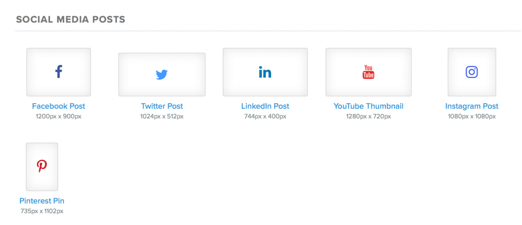
A user can then go on to choose from pre-made design templates, all of which can be personalized or let you create a thumbnail image from the ground up.
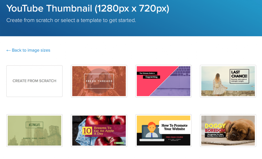
The tool gives you the power to customize different aspects of a template as well such as the text, font, borders, graphic, location of design elements and the background image.

You may also choose to go for the intuitive sliding scale visual effects which let you carry out tons of tasks such as blurring the background image or even brightening it up.

You can also upload customized background images that also include a screenshot from a video footage. You may as well upload customized graphic such as logo or branding as and when required.
To expedite things up, you can duplicate images to create similar thumbnails for your next video projects.
Setting up a featured thumbnail on YouTube
This is an extremely simple process that won’t take more than a few seconds. Once you have successfully uploaded a video, an array of default screenshots will be displayed at the bottom of the video configuration. A button named as Custom Thumbnail is located to the right of these images. Simply click it to add the thumbnail you intend from your computer.
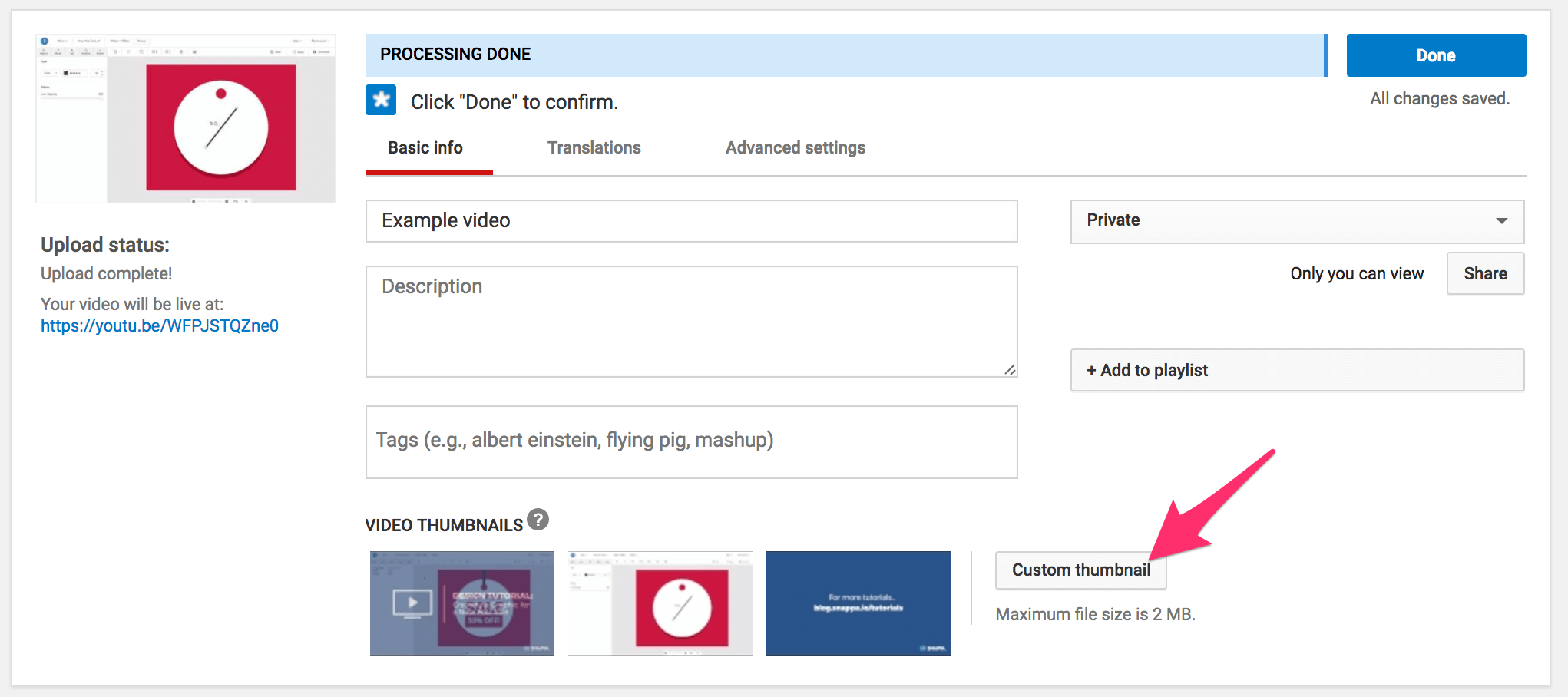
Once the thumbnail has been uploaded, it is displayed in the place of the Custom Thumbnail button. You can change it again by clicking on this image. You can also view the thumbnail preview on the top left.
You can change a video’s featured image as and when required even after the video has been published for a long time.
What should a thumbnail represent?
Now, as we have discussed the technical details, we can now spend some time on the innovative elements.
There are a plenty of options that you can choose from while deciding the type of image that your thumbnail should be,

More often than not, businesses will prefer to use thumbnails that are displayed by default at the bottom of the video settings. However, we strongly believe that it tends to limit the potential of your video. Custom thumbnails will make your video stand out from the crowd. They ensure that your videos give a semblance of being professional and of top notch quality.
A thumbnail comprising simple graphics and the title of the video is generally the go-to option. A number of images portray the enterprise’s name or logo in one of the bottom corners so that it does not occupy too much of space.
You may as well capture a screenshot from your video and use it as a thumbnail. In most of the cases, businesses would still employ an image editing tool to augment graphics and text based content in the thumbnail.

Another option could be to capture photographs or still images from the video and to apply them to graphic images. This is a popular option when it comes to pictures of people as shown in the image below.

Irrespective of the image that you go for, consistency in the way they look is the key. Most of the businesses would add the same unique branding to all of their videos even if the image itself changes. This makes it comfortable for your audience to relate themselves to your videos and assists them choose content in the video suggestions that appear to the right side of the page. This can be beneficial in getting more clicks and hence views while ensuring that your brand is recognized aptly by your intended audience.
Best practices
Along with some of the suggestions that have been discussed above, there are few best practices that you can employ with each thumbnail to get the best possible results.
Some best practices to keep in mind include the following.
Capture still images
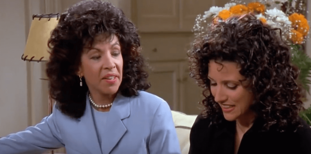
Have you ever wondered that when a video is paused, the person on the video is almost always making some preposterously embarrassing expression even if it does not appear to do when the video is playing? The same thing should not be displayed in your thumbnail images.
If you are hell bent on using a real image in your YouTube thumbnail, you will actually be doing yourself a massive service. By getting a staged photograph captured, you can get yourself a top quality image for your thumbnail.
As a matter of fact, it is quite rare that you get a good quality still image by pausing the video and capturing a still shot. The reason is quite logical; the video is always in motion and to get a still image is not all that easy.
It is very important that you get a top quality image that is not lifted from the video.
Employ contrasting colors

The use of appropriate colors is essential to getting more views and hence clicks on your content. So, the use of contrasting colors becomes of paramount significance.

Contrasting colors have the impeccable ability to attract eyeballs when it comes to graphics and text on images. This can play a pivotal role when you are standing in a long queue of suggested videos or search results.
The text and graphics become a lot more pronounced when contrasting colors are employed. In the example given below, a portion of the branding is cropped since the colors blend together. That is specifically not what you want to happen.
Moreover, the use of vibrant colors will also attract more views. You can employ our tool to brighten virtually any image with just a few clicks. You can also enhance the color saturation to attract more eyeballs.
Having said that, the image ought not be too bright or unrealistic that it offends the audience. As a matter of fact, minor adjustment could do the trick.
Use whitespace
You should learn to use whitespace to your maximum advantage when using graphics and design image. This ensures that your thumbnail appears clean and well structured. In addition, the thumbnail seems to be a professional work of art.

All of the ready to use templates that we offer come with well-structured layouts and efficiently employ whitespace. This attracts more eyeballs and hence gives the audience a glimpse of the video in a quick time. This can play a vital role in attracting more viewers and hence enhancing traffic to your channel.

Keep it short and crisp
One of my instructors in my copywriting class used to ask us to write our entire day in a single sentence. And then we were asked to reduce it to just four words. That is absolutely true about the text that you place over the thumbnail image.

Your image is simply an image. If someone is interested in having a look at the title of the video, he or she may as well have a look at the title given next to the video. They can get more details about it in the video’s description.
This means that title of the video or any other explanatory text in the video’s featured images should be short and crisp. The whole description is not required and you simply need to put in a few luring words that will attract the attention of your intended audience. So, instead of putting “Top 10 Hilarious Moments of Barney Stinson from How I Met Your Mother”, you may as well go for “Top 10 Barney’s Hilarious Moments”. It has everything in it to grab the attention of the viewer as it concise and to the point.
Mistakes to stay clear of
We have been discussing all the right stuff that you should definitely do to ensure that you get your YouTube thumbnails as perfect as possible. Now it is time to have a look at the don’ts of this subject.
The most obvious things to avoid are the usage of default thumbnails for your videos and the use of wrong thumbnail sizes. Here are some of the other mistakes that you should definitely avoid.
Too small text

In some instance, brands try to use small sized text so that it does not detract the viewer’s attention span from the actual image itself. Sometime we get too complacent and the text we use is too small to read when the image is a small thumbnail in searches or video suggestions. This can inevitably go on to decreasing the number of clicks,
An image that is irrelevant or misleading
This tends to happen more often than not as enterprises opt for marvelous stock photos that are never ever displayed in the video.

I once encountered a video titled “How to draw flowers on cupcakes”. The thumbnail boasted a lovely cupcake with flowers strewn all over it. After going through the entire video, it dawned upon me that the image was a stock photo and the video’s final product had nothing that looked even closer to it.
Do not forget the split test
Thumbnail images are part of our internet marketing strategy and so should be subjected to split test. You should employ the split test to your thumbnail images while you figure out the kind of images that you should try out for your channel. Try and have a look at the different kinds of images and which one of them get you the larger number of organic views. Analyze what draws the optimum response from your videos on other social media platforms such as Facebook or Pinterest. Once you determine what is successful for you, you can go on and change the video thumbnails across the board.
The Upshot
A lot of enterprises opt to use the default YouTube thumbnails rather than going for the customized ones. As a result, they have to compromise on the interesting and engaging thumbnails that could gain them more clicks and views. While creating customized images for YouTube, ensure that they are appropriately sized and you follow the best practices.
What kind of thumbnails get the most clicks on YouTube in your opinion? What has been a successful strategy for your brand? Do not forget to share with us in the comments section below.